Seventy Five
For this project, I had to create a company and a packaged product. It ended with Seventy Five, the holy grail of juices.
Why “Seventy Five”?
It’s simple, really. Seventy Five juices contains 75% of the nutrients your body needs daily. That’s vitamins, prebiotics, probiotics, and of course, your recommended intake of fruits and veggies.
It’s as simple as one bottle.
The Process
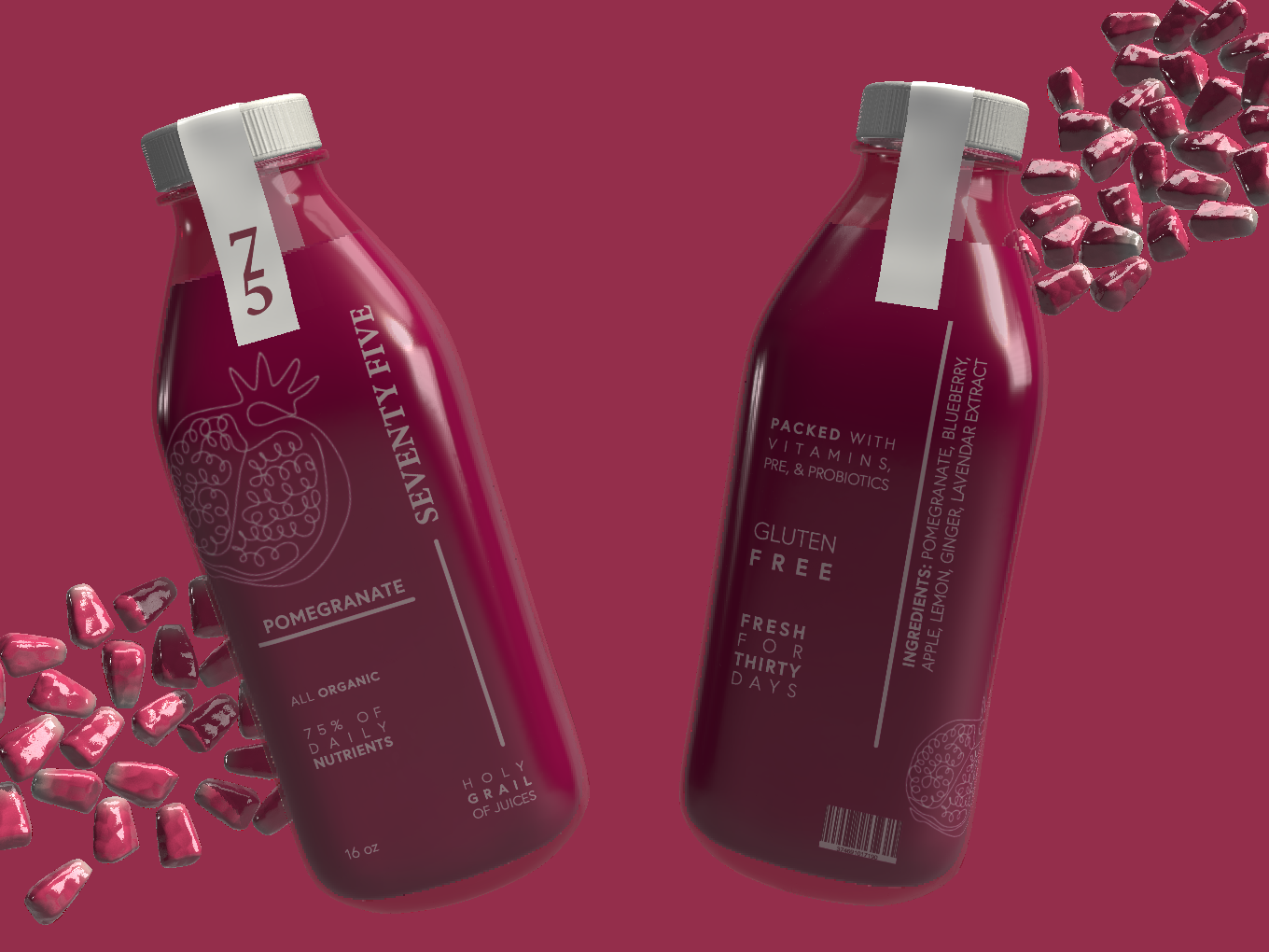
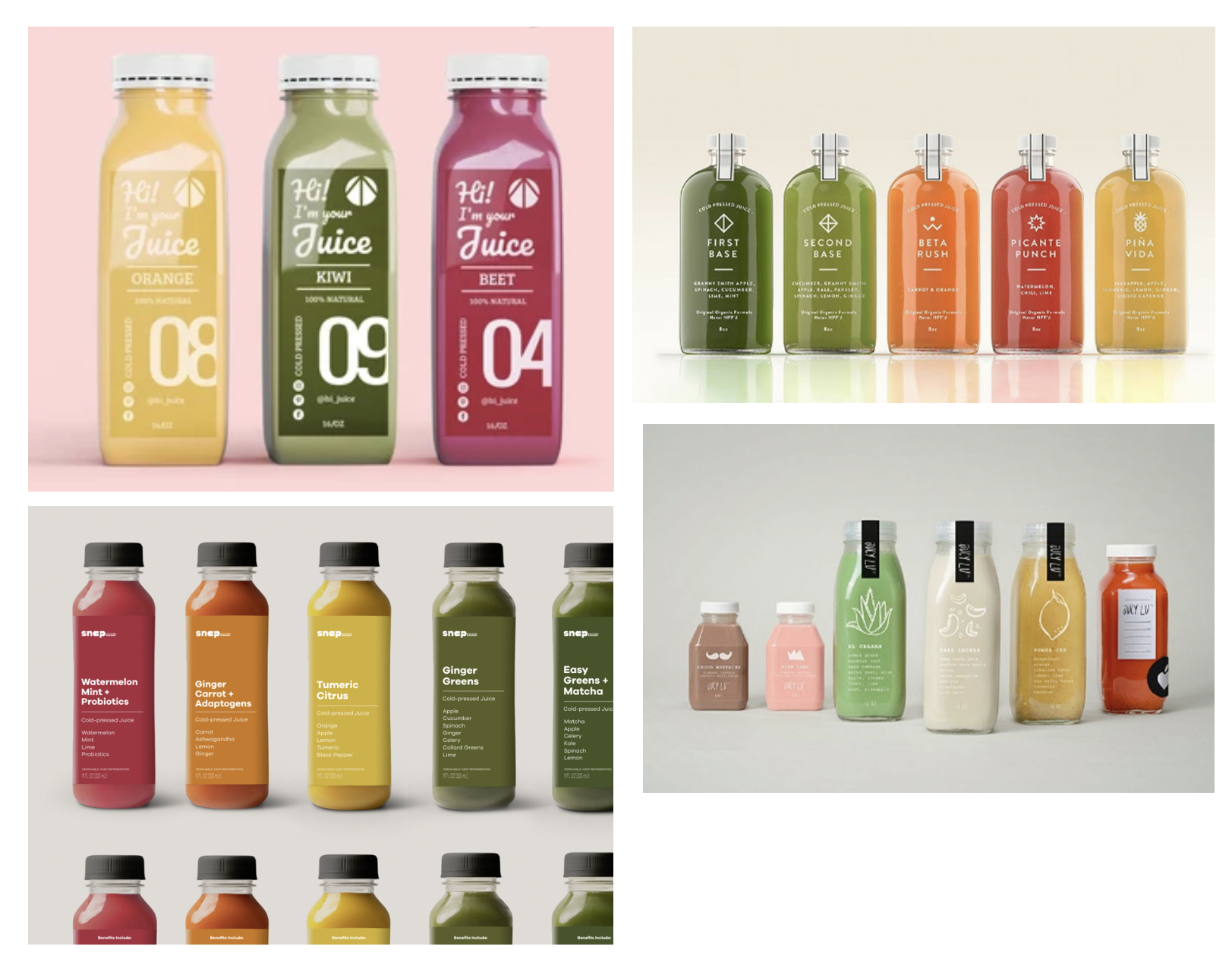
To start this project, I did extensive research on all of the “health” juices on the market. To beat the competitionn, Seventy Five is branded to be the “holy grail of juices” meant to encompass all of the health juices on shelves. One bottle of it replaces all the others.
Seventy Five’s brand is a more elevated look aimed towards the audience that is health conscience and because of that, usually among a sophisticated crowd. For that reason, Seventy Five must be a sophisticated brand.
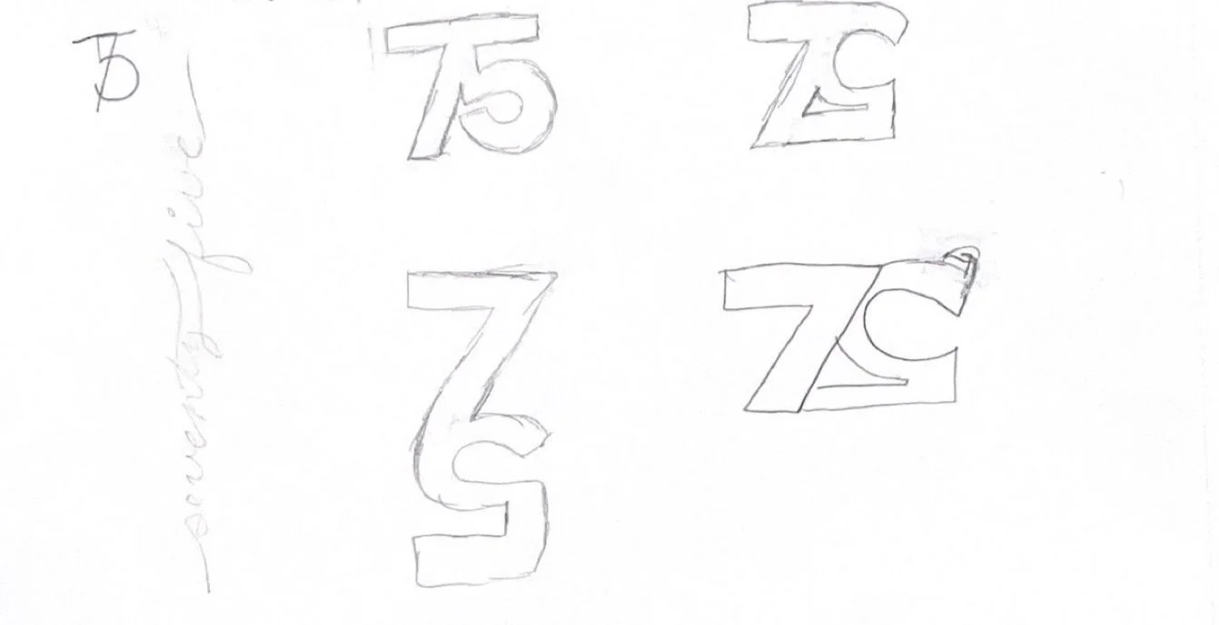
Once the name was picked out, I created logo iterations and vectorized the final one. After which, I was able to start designing a label for the bottle.
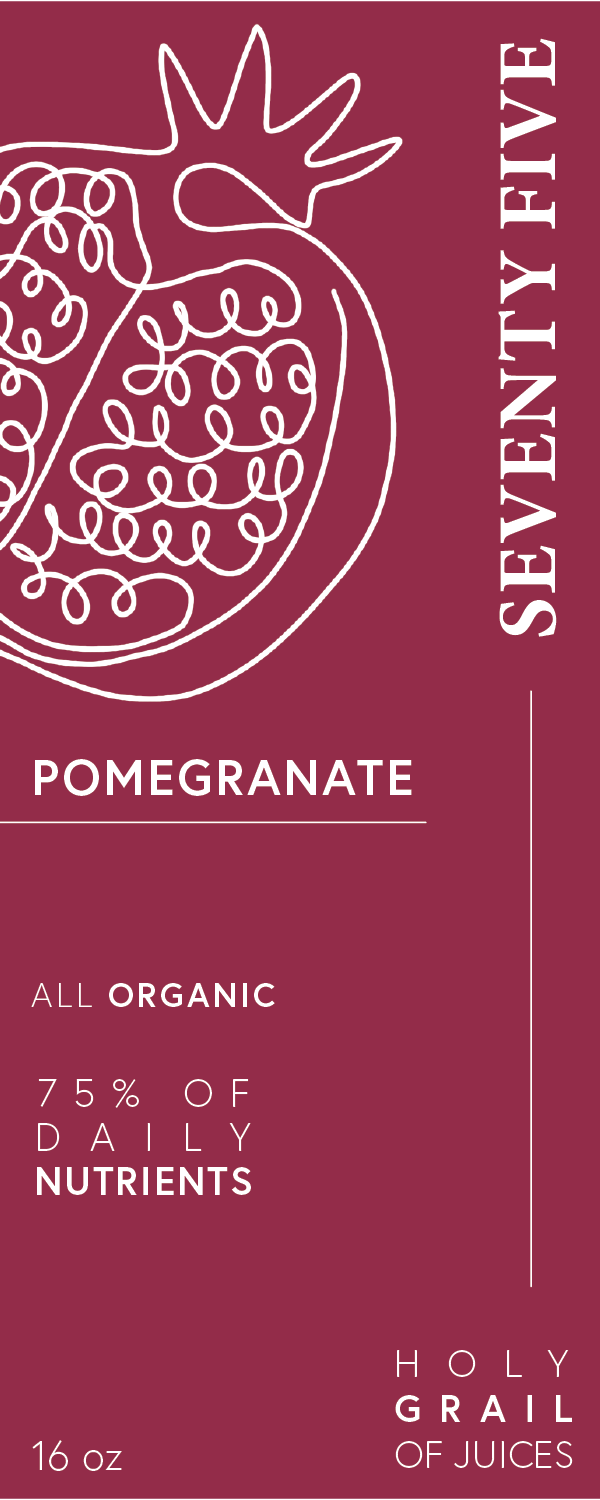
The Label
For this label, I decided to make use of negative spacing. To create an elevated look, is to make it simple and clean. With the appropriate use of negative spacing, type, and sizing, I was able to achieve the exact look needed for Seventy Five’s brand.
The label shown is for one of the many flavor of Seventy Five. Each label would show an illustration of the fruit it is flavored after and make use of a clear label to allow the colors to show through.
The label and bottle of Seventy Five will allow it to stand out on a shelf among its competitiors.