Maple Grove Rebrand
For this project brief, I had to find and redesign a brand’s label that needed refreshing. I chose Maple Grove’s outdated maple syrup label and bottle.
The Process
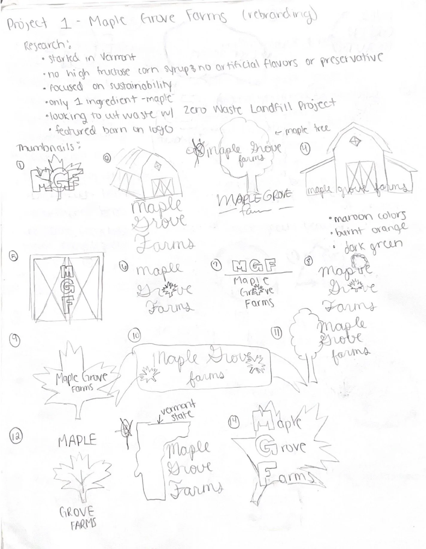
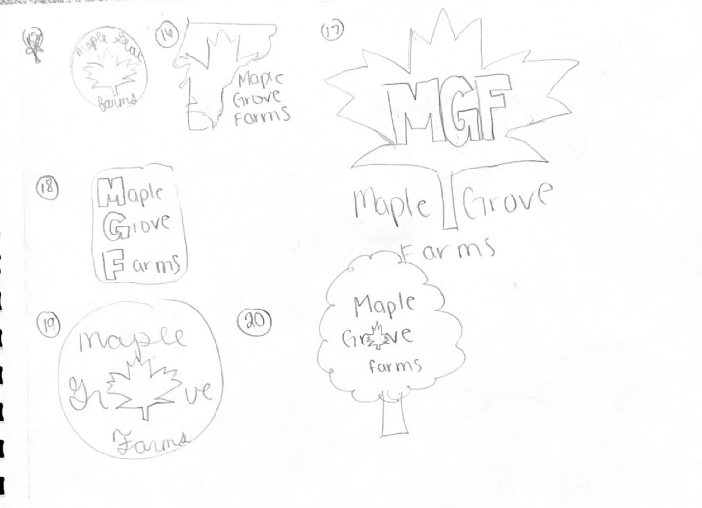
To start this project, I did extensive research on Maple Grove’s competitors and how the brand could stand out. After deciding the brand’s new approach to marketing itself, I sketched several iterations of their logo.
For the style of their logo, I wanted something that would capture the history behind their brand as that is important to their company.
After which I vectorized 3 of them and decided on the final logo.
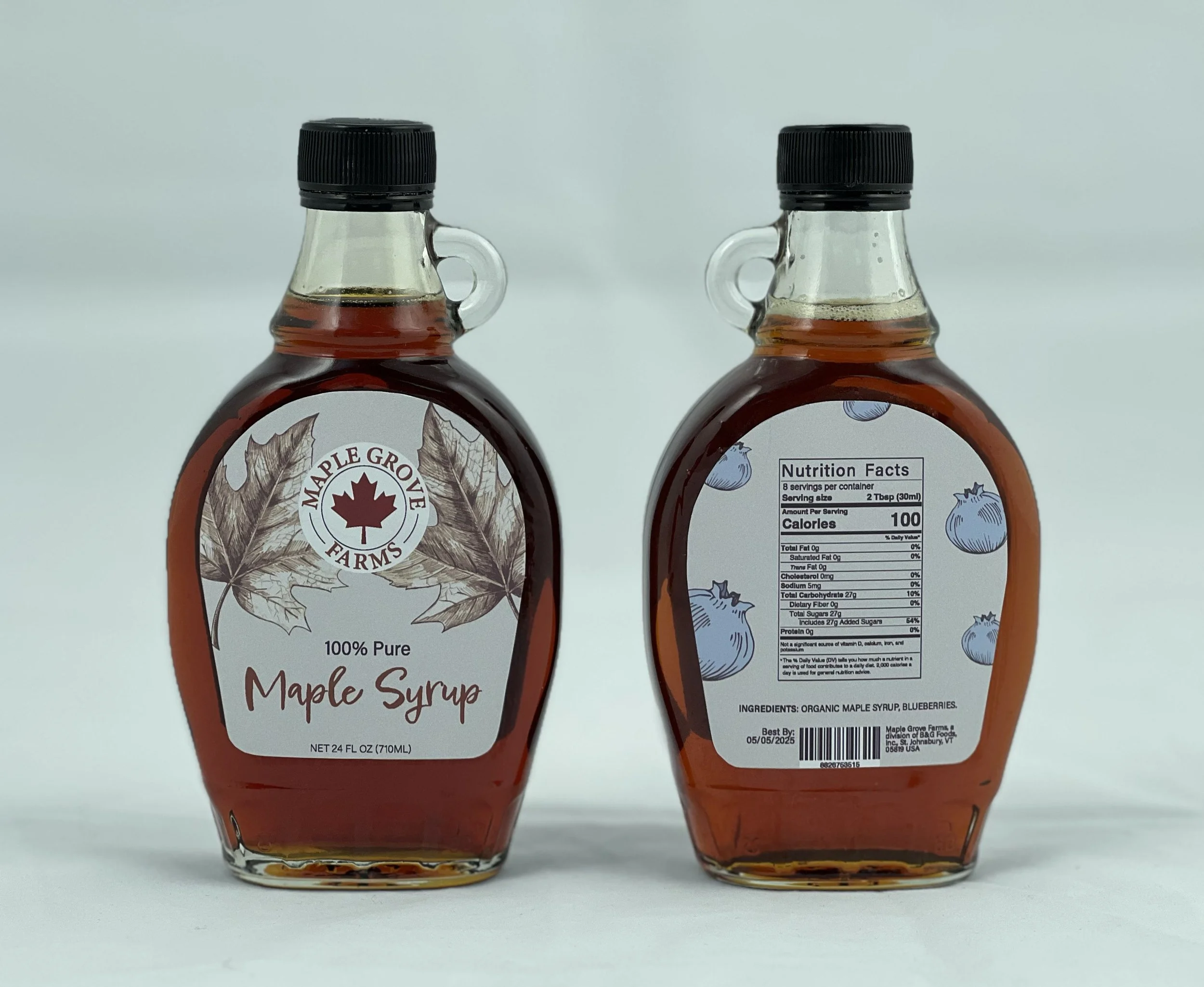
The Label
Once the new logo was set, I went into designing the label for 3 different maple syrup flavors. To distinguish each flavor, I added an illustration to the label, along with color coding the type of the syrup.
For the style, I decided on a vintage look because Maple Grove is centered around its roots and plays into that very often with their marketing.
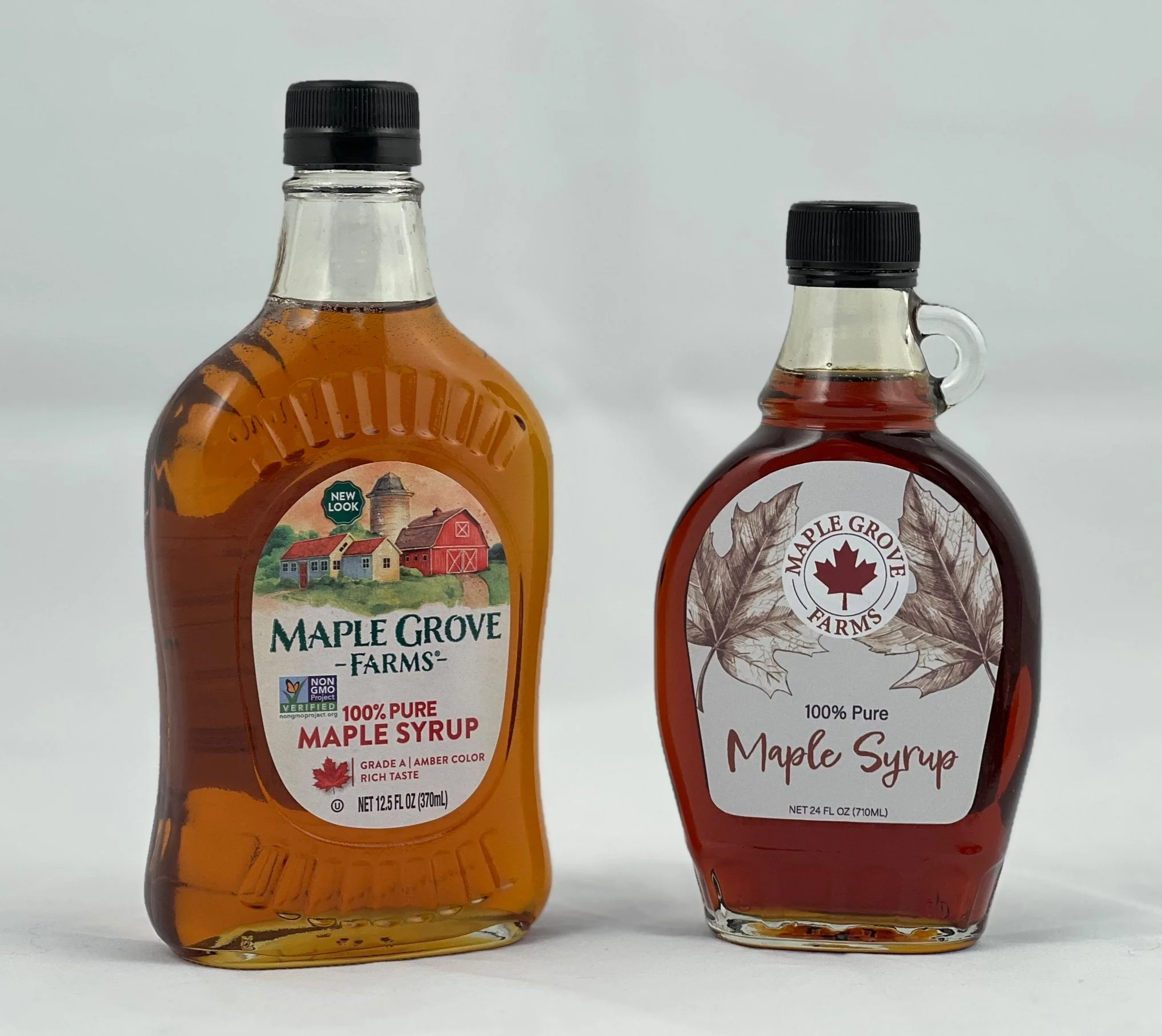
For the label, I chose to make it bigger and to fit the bottle so that the consumer can easily read the information. Instead of keeping the old bottle, I chose to go with a smaller, more ergonomic bottle so that it can easily be held in one hand.